You’ve landed on the moon, and now you need to plant your flag to assert your WordPress dominance and test the spaceship (website) we built to make sure it is ready for its launch back to Earth! This final step for man/woman-kind is all about completing your blog and adding the finishing touches. If you’ve checked out what we’ve built to this point, you may notice that it doesn’t quite look exactly like it should just yet. Together, we will complete our journey into the final frontier and make sure you have a super professional blog capable of breaching Earth’s atmosphere 🙂 .
Most of the final touches that we are going to be making take place in a far off land we haven’t visited yet. In this distant oasis, lies a powerful force that can take your website from good to great. On your WordPress dashboard it is a deceivingly simple link called Salient. This link unlocks the secret powers of the Salient theme, its powerful theme settings. Let’s venture together into this unexplored territory. Hold our hands and never let go… until the end of this page.
Salient Theme General Settings
Let’s start at the top of the Salient theme settings and work our way down the list. To get started, hover over the Salient link and click on General Settings.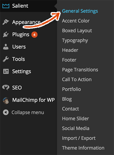 First up, we’re going to add a favicon to your website. A favicon is a teeny tiny little 16px by 16px version of your logo or a similar representation of your brand. It is the little icon that appears in the tab of your web browser when you visit a website. For example, Google.com’s favicon is a white g in a blue box (see below).
![]() We created our favicon using photoshop. We typically shrink down our logo into a 16px by 16px version or take the most prominent part of our logo and shrink that down into the 16px by 16px version. Check out our little favicon and feel free to right click on it and click Save Image As to use it as your icon.
We created our favicon using photoshop. We typically shrink down our logo into a 16px by 16px version or take the most prominent part of our logo and shrink that down into the 16px by 16px version. Check out our little favicon and feel free to right click on it and click Save Image As to use it as your icon.![]() Click the Upload button in the Favicon Upload section.
Click the Upload button in the Favicon Upload section.![]() Find your favicon image and Upload it.
Find your favicon image and Upload it.![]() Select your Favicon from the media library.
Select your Favicon from the media library.![]() Click the green Save Changes button at the top of the General Settings page.
Click the green Save Changes button at the top of the General Settings page.![]()
Using Google Analytics in WordPress
There are a number of other settings you can adjust in the General Settings but we’re going to leave most of them on their defaults. The next setting we want to adjust in this section is Google Analytics.
Google Analytics helps you determine how many users are visiting your site as well as the different actions that they’re taking on your site. It’s a great way to determine how users are using your site, what areas of the site may be a bottleneck for your users and whether you are funneling users to where you want them to go. It has lots and lots of additional features, including a way to get a real time view of what users are doing on your site (you can see how many users are reading a certain post or looking at a certain page of your site at this particular moment).
Since Google Analytics could be an entire step itself, we’re going to assume you either already have your account set up or you’re not quite ready to use Google Analytics just yet. If you don’t have a Google Analytics account and want to set it up, check out our post on signing up for and using Google Analytics and then come back here. We highly recommend using Google Analytics so that you can better serve your visitors.
Feel free to skip this section if you’re going to hold off on adding Google Analytics. Otherwise, go to Google Analytics and login to your account. Once you’ve successfully logged in, click on the domain that you want to associate with your WordPress blog (for us it’s testuser.com).
 Click on the Admin link in the navigation bar at the top.
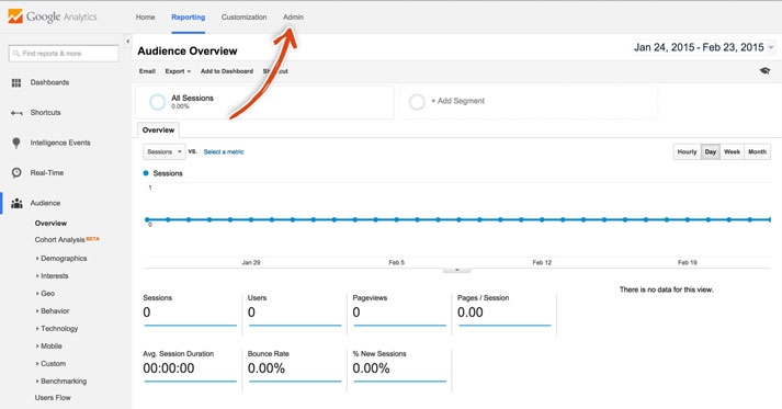 Under the Property Settings column, click on the Tracking Info link and then on the Tracking Code link.
![]() This will pull up a page that shows the tracking code underneath the text “This is your tracking code.” Keep this code close as you will need it below.
This will pull up a page that shows the tracking code underneath the text “This is your tracking code.” Keep this code close as you will need it below.![]() Scroll down to the bottom of the General Settings section, you should see a Google Analytics section. Copy and paste the Google Analytics tracking code that you got from your Google Analytics account into this field.
Scroll down to the bottom of the General Settings section, you should see a Google Analytics section. Copy and paste the Google Analytics tracking code that you got from your Google Analytics account into this field.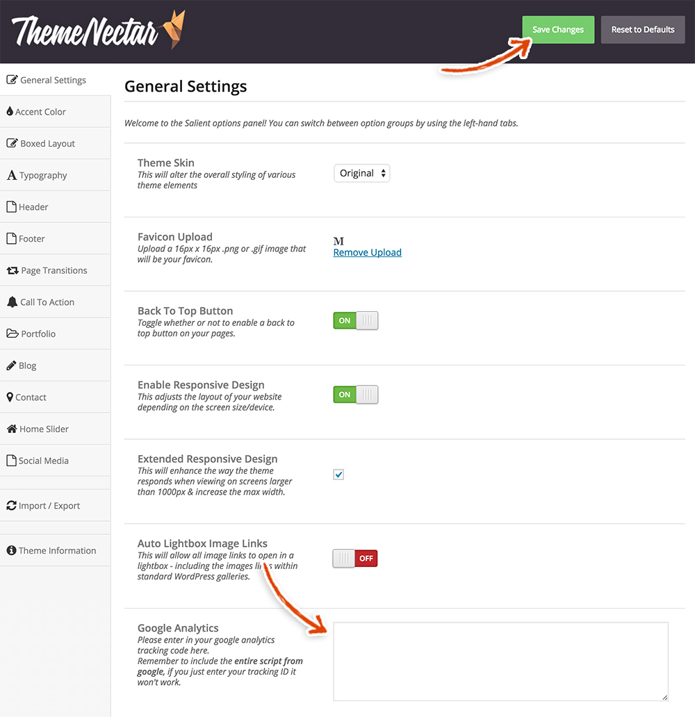 Make sure to click the green Save Changes button and you should be off to the races!
You will know that it is hooked up correctly if you go back to your Google Analytics account and you see a status of Receiving Data – like so.![]() If you need more of a visual check, then go back to your Google Analytics dashboard and click on the Reporting section. Then, click on the Real Time tab in the left sidebar.
If you need more of a visual check, then go back to your Google Analytics dashboard and click on the Reporting section. Then, click on the Real Time tab in the left sidebar.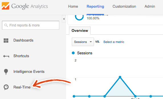 Finally, click on the Overview link.
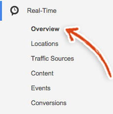 In order to check if it’s working correctly, go to the home page of your blog and read a post and then go back to the home page and read a couple more posts. The active users on the site should go to 1 and the Pageviews graph should show some activity.
Salient Theme Custom CSS
You should still be in the Salient theme General Settings section. If you’re not, then I’m afraid we may have lost you forever. The next step is a pretty advanced final touch. So, if it’s a bit over your head, never fear, we’ll walk you through everything that you need to do to make your site looks exactly like our blog demo site.
We’re going to be adding some custom CSS to your website. CSS stands for Cascading Style Sheets. These are basically instructions that tell the browser what styles to apply to elements on your website. For example, you’ve probably seen buttons on just about every website on the internet. Some buttons have sharp square corners, while others have smooth rounded corners. CSS gives you the ability to tell the browser to put sharp corners or rounded corners on your buttons! In order for the browser to know what styles to apply to certain elements, you have to name those elements with something called classes. Let’s go take a look at this in action so that you can get a better idea what we’re talking about.
Go to the homepage of our blog demo site. Hover over the Mindless Musings title in the middle of the page, right click on the page and click inspect element (You may need to enable the developer toolbars in the browser’s settings or preferences depending on the browser that you use – this can be a huge pain in the butt and since we want to get your website done don’t worry about this if you don’t want to mess with it).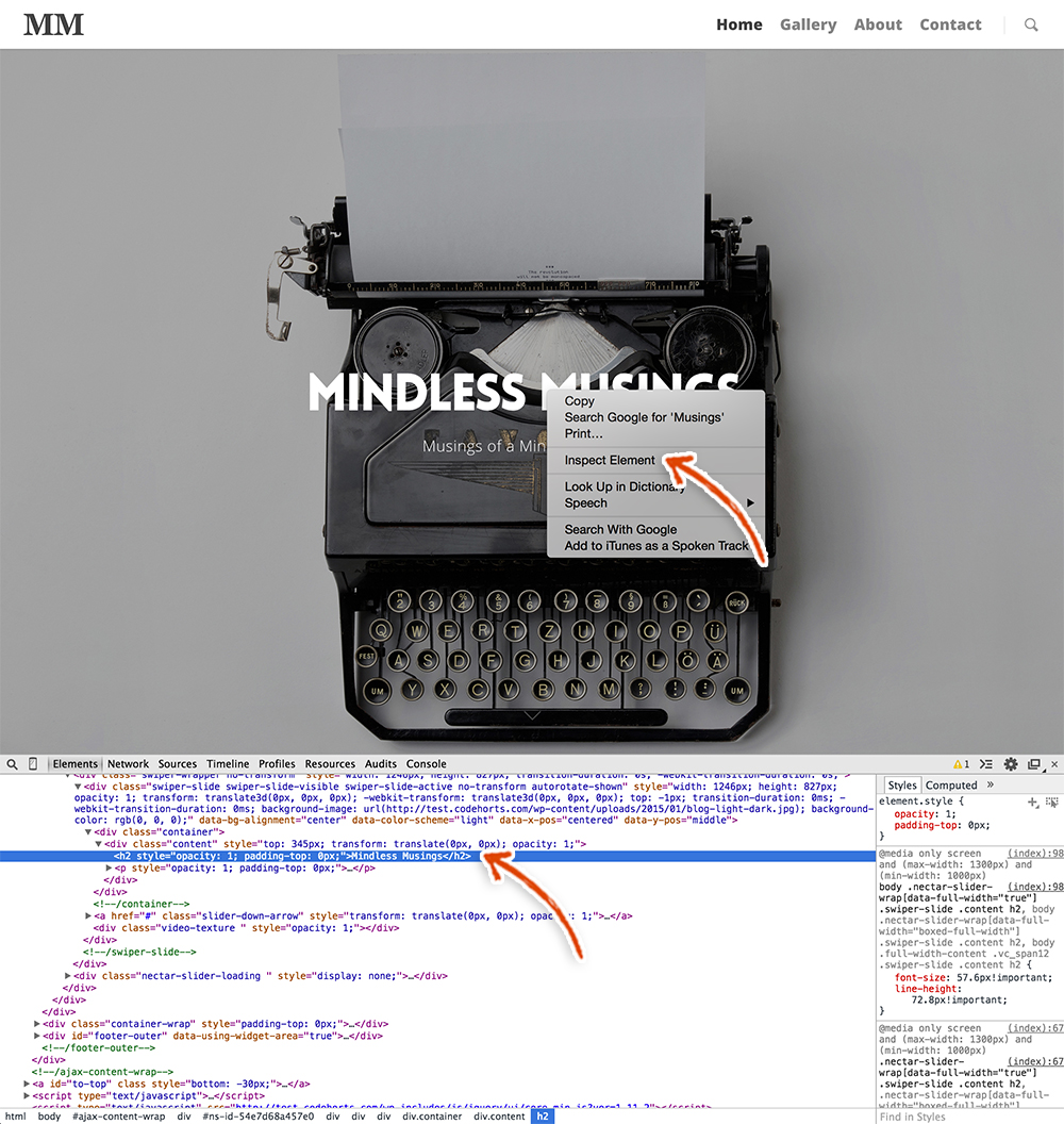 This gives you the capability to see the raw HTML and CSS code and change both in order to test what certain elements look like with different CSS rules. You can see the CSS rules specific to each element by selecting the element and viewing the CSS rules on the right side of the page. You can also add CSS rules for that element on the right side of the page as well.
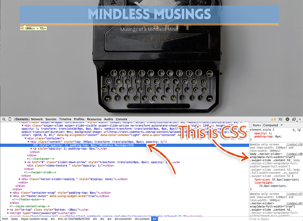 CSS is actually super simple. Let’s change a few properties real quick, so you can get a better idea of what it does. Make sure you’ve selected the Mindless Musings element, it should be blue if it’s selected. On the right hand side of the inspect element console, you can actually edit the CSS. Click on the font-size property and change the font-size to 100px. The Mindless Musings title should now be huge on the page! There are tons of different things you can do with CSS like add drop-shadows, font colors, and even animations!
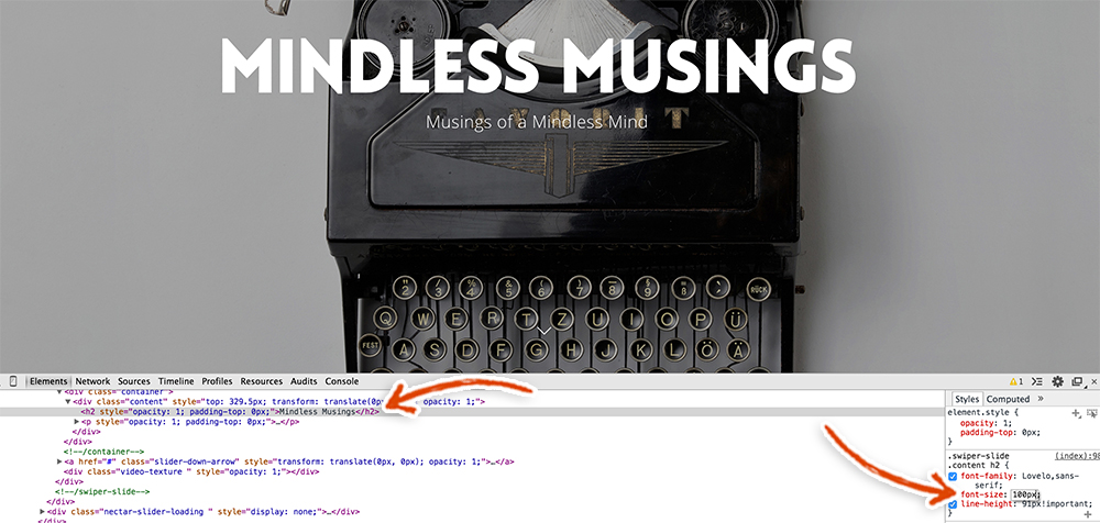 CSS is super fun and we love playing with it. Unfortunately, going any further down the CSS rabbit hole is a bit beyond the scope of this launch guide, so we’re going to keep moving forward and get your website done! While the Salient theme is awesome out of the box, we wanted to dial up the style just a touch to make your new website extra special! Below is the custom CSS that we wrote to style it up. Copy and paste this CSS into the Custom CSS Code section.
article.post .post-meta { display:none;}
.post-content {padding-left:0;}
.container-wrap {background-color:#fff;}
article.post .content-inner {border-bottom:0;}
.post-header {font-size:14px;}
#footer-outer .widget h4 {font-size:22px;}
.single-post article.post .content-inner {padding-bottom:0;margin-bottom:0;}
.single #page-header-bg #single-below-header > span.meta-comment-count {display:none;}
article.post .more-link {display:none;}
.nectar-social > *:first-child {display:none!important;}
.post-header .meta-comment-count {display:none;}
#footer-outer .container {max-width:100%;padding:0 28px;}
#header-outer.transparent header#top #logo, header#top #logo.no-image {font-weight:900;font-family:Georgia;font-size:36px;}
.big-letter {font-size:72px;color:#444;}
blockquote {font-size:36px;}
.wpb_row {margin-bottom:0;}
.comment-title {font-size:36px!important;line-height:59.4px!important;font-family:Open Sans;font-weight:800!important;}
@media only screen and (max-width: 1300px) and (min-width: 1000px), (max-width: 690px) { .comment-title {font-size:25.2px!important;line-height:41.58px!important;} }
.fb-comments, .fb_iframe_widget_fluid span, .fb-comments span, .main-content iframe[src] {
width:100%!important;
}
.portfolio-items .col .work-info .vert-center {display:none;}
.portfolio-items .col .work-item.style-3 .work-info-bg {opacity:0!important;}
body[data-bg-header="true"] .container-wrap { padding-bottom:0!important;}
.padding-bottom-0 { padding-bottom:0!important;}
.padding-top-0 {padding-top:0!important;}
.margin-bottom-0 {margin-bottom:0;}
.profile-pic img {position:absolute;left:43%;top:-100px;padding:5px;background:white;box-shadow:0 1px 0 rgba(0,0,0,.15);border-radius:100%;}
#header-outer {padding-top:15px!important;}
#footer-widgets a, #footer-widgets p {font-size:16px;}
#footer-outer .widget h4 {text-transform:none;font-size:18px;font-weight:800!important;}
#footer-outer #footer-widgets .col input[type="submit"] {width:100%;padding-top:12px;padding-bottom:12px;}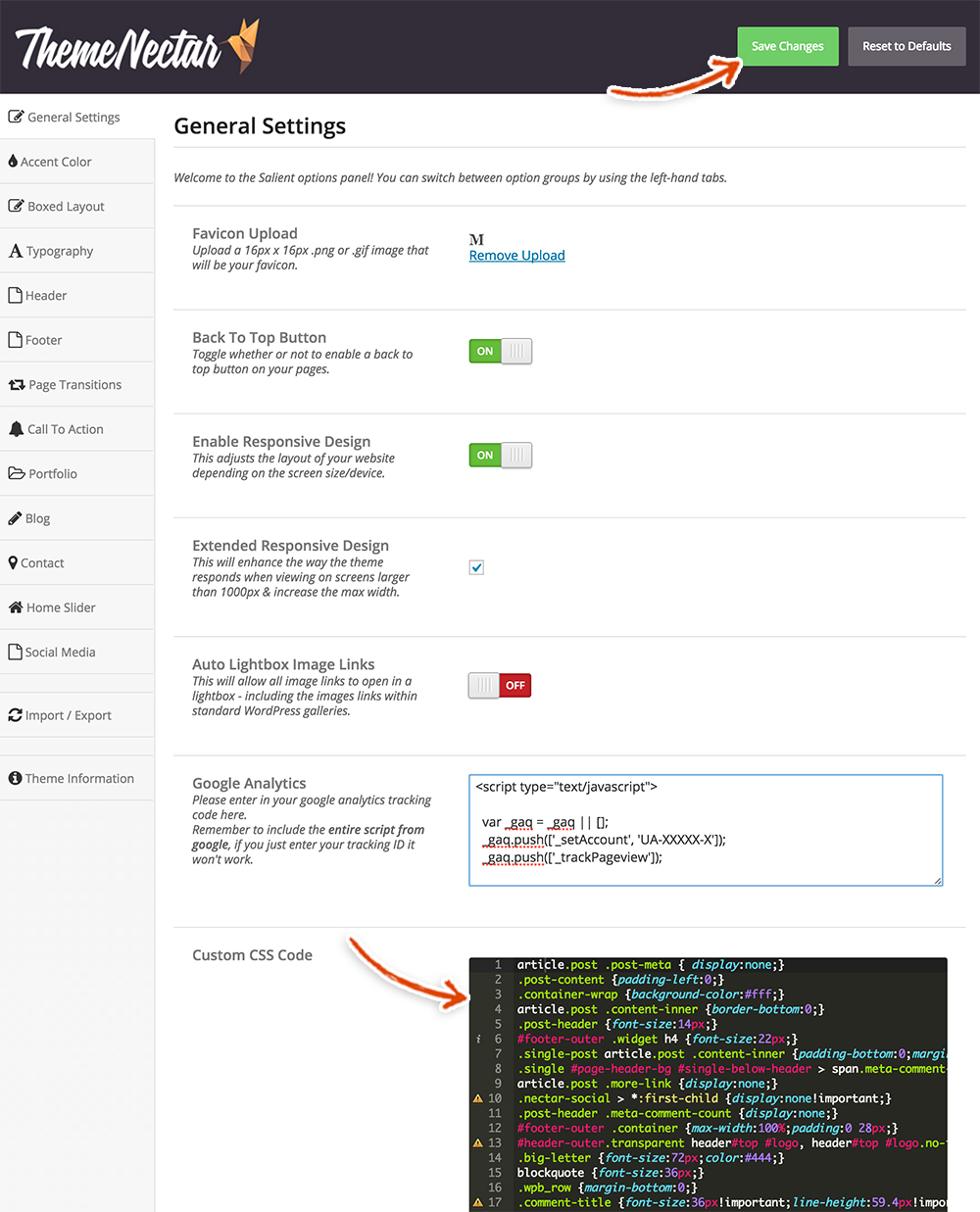 Make sure to then hit that green Save button in the top right of the page. Woo Hoo!! That’s it for the General Settings section! If you go and check out your new website, it should look pretty sexy now with all those fancy styles added. Feel free to mess with the styles as much as you want. If you want to learn more about CSS go to W3schools. They have awesome, quick tutorials for all kinds of nerdy stuff and we actually used it as a resource when we were learning to code and still use it to this day!
Salient Theme Accent Colors
Onward and upward Mon Frere! Let’s head over to the Accent Colors section of the Salient theme settings. Click on the Accent Colors tab.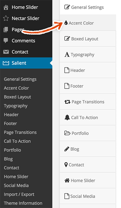 The Accent Color that you choose will (as explained) alter the global accent color of the site. We’re only going to change the main Accent Color, as it’s the only one we used throughout the site. Click on the Select Color button in the Accent Color section and type in the color #444444 (this is a hexadecimal value that represents a charcoal-black like color).
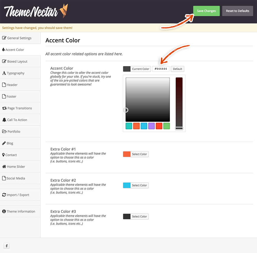 Click that pretty green Save Changes button at the top of the page. As described, the Extra Color options just give you more color choices when you create certain elements using Salient (for buttons, icons etc.). Feel free to play with the Accent Color to customize your website to your fine tastes.
Salient Theme Typography Settings
Giddyup, it’s time for some Typography changes! The importance of this final touch can’t be overstated 🙂 . It is something that you may not remember to do if you’re just starting out. Usually though, it’s one of the more fun things to do because a font really sets the tone for the voice of your website. Is your website serious? Is it fun? Your font can really communicate that attitude.
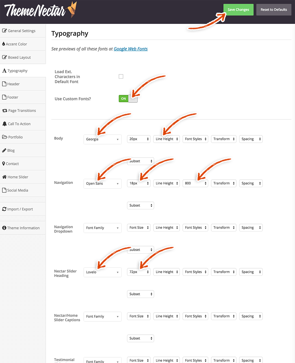
Click on the Typography tab.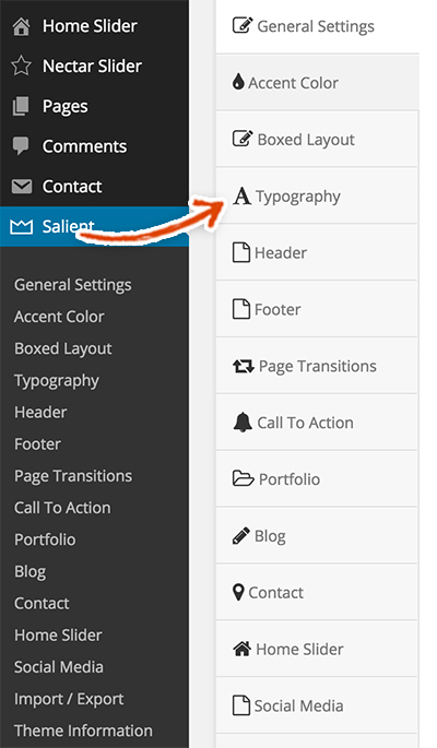 You will see the page below. Make the following changes. You’ll notice we didn’t change every font style, only the ones we thought would make the site look even more beautiful. Again, these are the font styles and sizes that we used. Feel free to explore your creative side and play with these to your hearts desire!
- Use Custom Fonts? – Turn it On
- Body
- Font Family – Georgia
- Font Size – 20px
- Navigation
- Font Family – Open Sans
- Font Size – 18px
- Font Styles – 800 (this makes your font bolder)
- Nectar Slider Heading
- Font Family – Lovelo
- Font Size – 72px
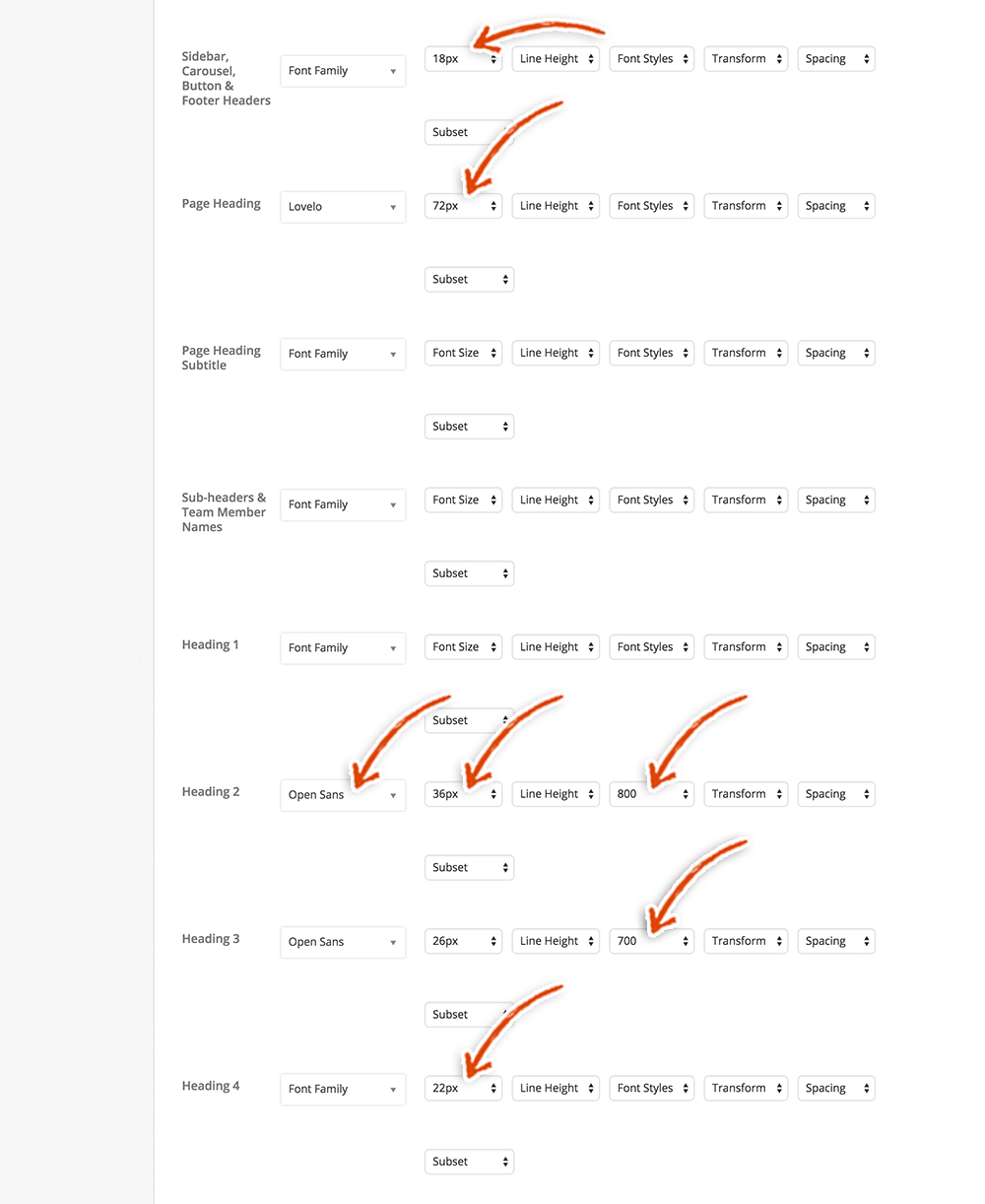
- Sidebar, Carousel, Button & Footer Headers
- Font Size – 18px
- Page Heading
- Font Family – Lovelo
- Font Size – 72px
- Heading 2
- Font Family – Open Sans
- Font Size – 36px
- Font Styles – 800
- Heading 3
- Font Family – Open Sans
- Font Size – 26px
- Font Styles – 700
- Heading 4
- Font Size – 22px
 As usual, make sure to click that big green Save Changes button and let’s keep on truckin!
Salient Theme Header Settings
Navigate on over to the Header settings section.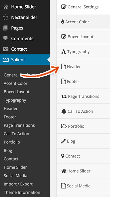 We’re going to leave the Header Layout on the Default Layout setting. The next item on the list is the Use Image for Logo? setting. In our demo blog site, we decided to just use a simple font treatment as the logo for our blog website. By all means though, please use a logo here if you have one.
To add a logo, simply check off the Use Image for Logo? checkbox and you’ll see a couple upload buttons magically appear. Upload your logo to your media library and then set it as your logo. As you’ll see, there are two places to upload your logo, Logo Upload and Retina Logo Upload. The Retina Logo Upload is so your logo doesn’t get blurry on higher resolution screens like smart phones and retina displays. Per the instructions, all you have to do is upload an image that is exactly twice the size of your original logo.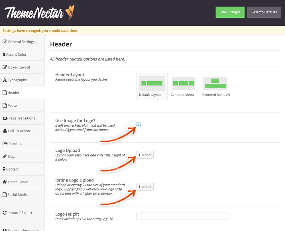 Finally, we’re going to change two other settings, the Header Padding and Full Width Header. We added padding to the header in order to add a little white space. Make the following changes.
- Header Padding – 14
- Full Width Header – Turn it on
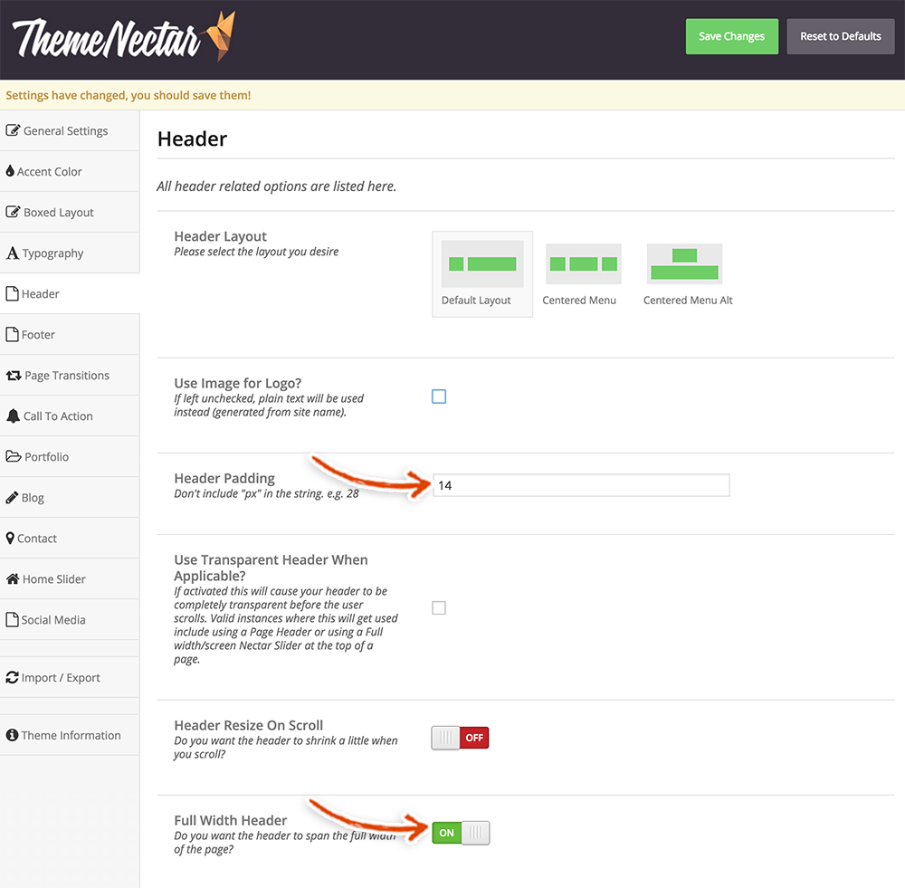 The Salient theme has a number of other cool header settings that are worth playing with. The Header Resize on Scroll is one of these settings; it means that when you scroll down the page the header shrinks down. We’re going to leave those alone for now but check em out!
Make sure to click the green Save Changes button at the top of the page. You should now be able to see the logo in the navigation bar of your site. Check out how it looks on the menu and make sure it is the size that you want it to be. If it isn’t fitting on the menu the way that you want it to, change up the logo height value. Building websites is like life, very fluid and you need to be able to adapt to any situation. As in life, if it’s not working for you, change it!
Salient Theme Footer Settings
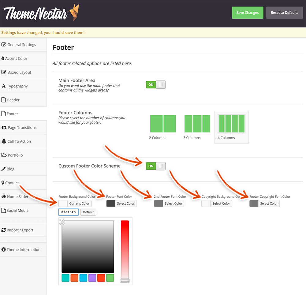
Just finished the header? Now, let’s kick it up a notch with some footer edits 😉 . Click on the Footer settings section.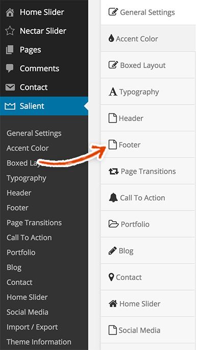 Let’s zip through this section right meow! Make the following changes to the Custom Footer Color Scheme section.
- Custom Footer Color Scheme – Turn it On
- Footer Background Color – #fafafa
- Footer Font Color – #444444
- 2nd Footer Font Color – #777777
- Copyright Background Color – #fafafa
- Footer Copyright Font Color – #777777
 Finally, we’re going to add some custom Footer Copyright Section Text. We put the Privacy Policy and Terms of Service pages down at the bottom of the page since, while they are important, they are the lowest priority pages of the website. Copy and paste the code below and make sure to use your domain name for the links so that they link to the correct pages.
<a href="http://yourdomain.com/terms/">Terms of Service</a> <a href="http://yourdomain.com/privacy/"">Privacy Policy</a>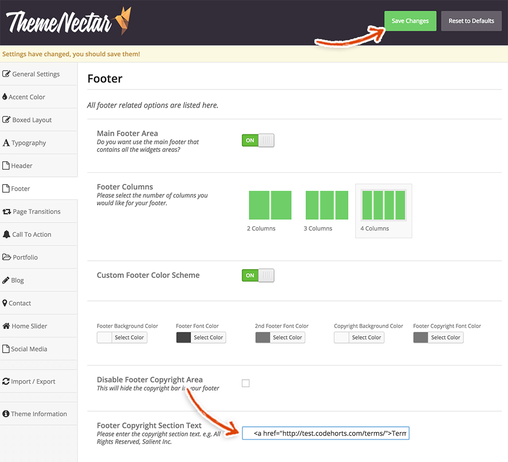 Click that beautiful green Save Changes button at the top of the page and let’s blow this popsicle stand!
Salient Theme Portfolio Settings
Do you remember building a Gallery page in an earlier step? Yeah we don’t either, but we actually did! We need to update some styles so that this page is as smooth as LL Cool J. Click on the Portfolio settings section.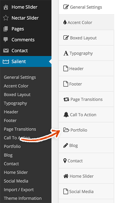 We can bang this section out right quick. Make the following changes.
- Main Layout – 3 Columns
- Project Style – Title overlaid w/ zoom effect on hover
- Masonry Style – Turn it On
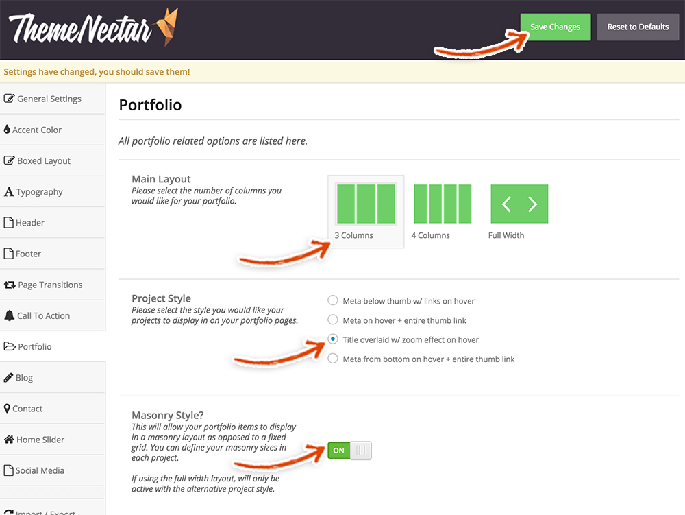 Fan-freakin-tastic! Make sure to click that Save Changes button!
Salient Theme Blog Settings
Now, it’s time to change the all important default blog settings. These are extra settings the developer of the Salient theme built so that you have more power over how your blog posts look.
Mosey on over to the Blog settings section.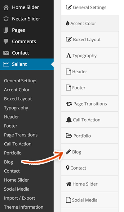 You should now see the Salient theme blog settings below. Make the following selections.
- Hide Sidebar on Single Post – Add Checkmark (This will remove the sidebar from your blog posts. You can leave it if you like but we like how sexy the posts look without a sidebar hanging around.)
- Hide Featured Image on Single Post – Add Checkmark (Since the featured image is in the blog posts header, we thought it’d be redundant to have it both in the header and in the post, so it’s gone-zo)
- Social Media Sharing Buttons – Turn this On (only if you want to)
- Facebook – Add Checkmark (again optional but it’s always nice to share)
- Twitter – Add Checkmark (tweet if you like twitter)
Finally, make sure to click that big GREEN Save Changes button. Also, note the button next to it that says Reset to Defaults. Be very very careful around this button because it will erase ALL of your changes – so DON’T PRESS RESET TO DEFAULTS!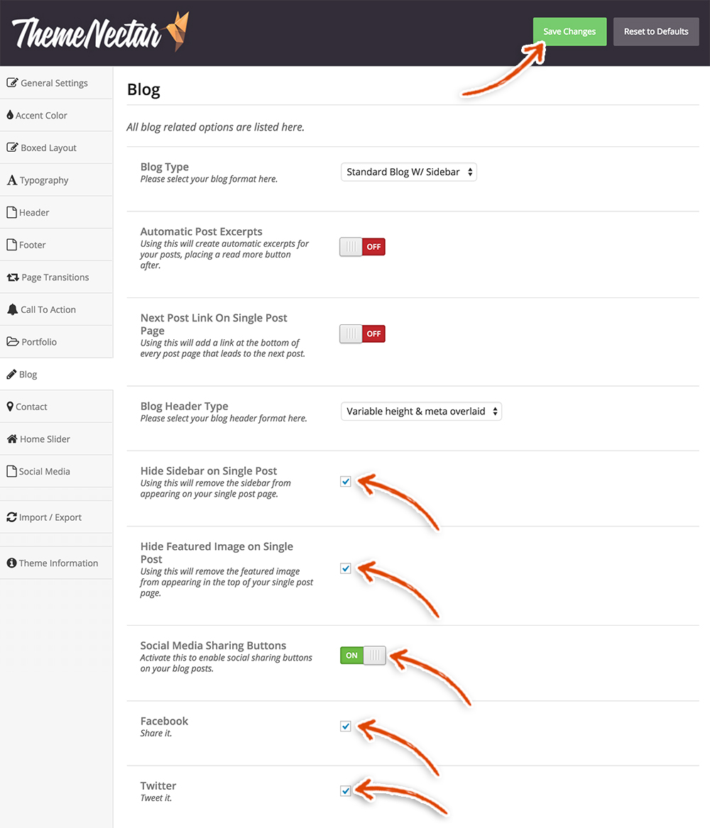 Whoa, that was exciting and fast! Great job!
Permalink Settings
T-Minus two more sections until we are all done!! We need to change the permalink settings (so that the url is readable for SEO purposes). The default layout is a really really bad option for SEO purposes and looks like wingdings.
Hover over the Settings tab in the left sidebar. Click on the Permalinks link.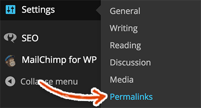 Check the Post Name option.
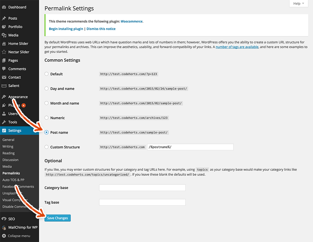 Then, make sure to click the Save Changes button. To make sure that the permalink changes have saved properly, go to your homepage and click on a post that you created. For example, we clicked on our post titled Riding My Scooter. The Permalinks setting that we just changed takes the title and makes the URL more readable. For the Riding My Scooter post, below is the URL that we now see.
![]() Compare this to the stupid default permalink setting which shows the post ID as the URL, as seen below.
Compare this to the stupid default permalink setting which shows the post ID as the URL, as seen below.![]()
Add New Users to Your WordPress Site
If you are the only person who will be accessing your WordPress dashboard, you can skip this section. However, if there will be multiple people logging into your WordPress dashboard, make sure to create a user for each of those individuals (and assign the roles appropriate to each user). This is critical for security purposes and for post update purposes.
Regarding post update issues, if you are working on a post and someone else logs into WordPress with your credentials and decides to start editing the same post, they could overwrite your changes. You would want to murder people if they overwrite a post that you spent hours crafting. However, if you both have different credentials, WordPress lets the other user know that you are currently editing the post and it locks it until you’re done. This just becomes more and more critical as you grow your blog because you will be managing more and more posts and users.
Additionally, if you only have one username and password for your WordPress dashboard and you give that to multiple people; all of those people have admin access (which isn’t what you’ll likely want) and if one of them decides to be malicious, they could do some major and potentially irreversible damage.
If you want to add new WordPress admin users check out our post, Adding New Users to Your WordPress Site.
Test the MailChimp WordPress Plugin
We’re almost there! This is the final Final Touch! It’s critically important to test out your MailChimp sign up form – to make sure that it is hooked up to MailChimp correctly and placing subscribers in the right list. Subscribers are an essential part of running a successful blog. Why, you ask? Because it gives you a list of people that are interested in your content and gives you a group of people that you can one day make money off of (if you would like 😉 ).
To complete testing your Sign Up form (and ensure that it is properly set up), go to the homepage of your new website and scroll down to the bottom of the page. Fill out the Subscribe form by adding your email address and clicking the Sign Up button.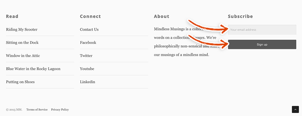 Then, check the inbox of the email address that you just used when you submitted the Sign Up form. Look for an email from the “from email” that you used when you originally added the MailChimp list. There should be an email asking you to confirm your subscription to the list. Click the “Yes, subscribe me to this list” button.
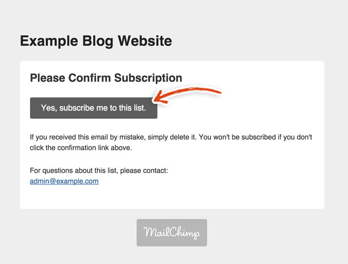 You should be redirected to this page:
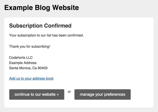 Now, you can make sure that this email address was subscribed to the appropriate MailChimp list by logging into your MailChimp account and clicking on the lists tab in the left sidebar.
 You should now see 1 subscriber associated with your list, who is that person?! Ohh wait, it’s you!
Houston, We Have Liftoff
If you chose the WPEngine Professional, Business or Enterprise Plans OR have purchased the CDN for your Personal Plan, then make sure to enable the WPEngine Content Delivery Network (CDN) to work with your site.
Otherwise, that’s it! You’re all done!! Your new blog is beautiful and you definitely deserve a huge pat on the back. We know how tedious it can be to create a new website. There are so many moving parts and often times the hardest part of doing anything is just getting started. We hope that we were able to make it a little easier to get started.
Please check back periodically as we’re constantly working on new Launch Guides. We’d love it if you scrolled down the page and Told Us What You wanted to Launch and Subscribed to our Newsletter so we can keep you posted on exciting stuff happening at WPLauncher. Thank you again!
Mission Control Note:
Feel free to use any hosting company that you prefer, but when you do purchase a hosting service, please do so after clicking on a link on our site to that particular service (either on this page or on our Best WordPress Hosting for your Website page). My brother Lee and I love what we do and we have spent countless hours creating WordPress sites and creating badass free resources and launch guides for building WordPress sites. We want to be totally transparent with you about how we are able to spend the time creating these free launch guides. We are able to provide these materials at no cost to you because we make money by referring our users to services that we use and that we believe in. We would never suggest a service that we have had bad experiences with in the past and are always looking to improve on what we recommend in order to give you the best possible experience. You keep the lights on for us and we are really grateful to you for that 🙂